Aperture Winery
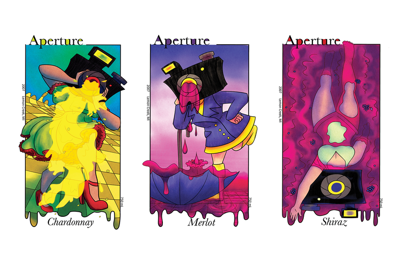
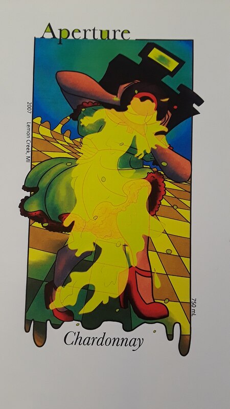
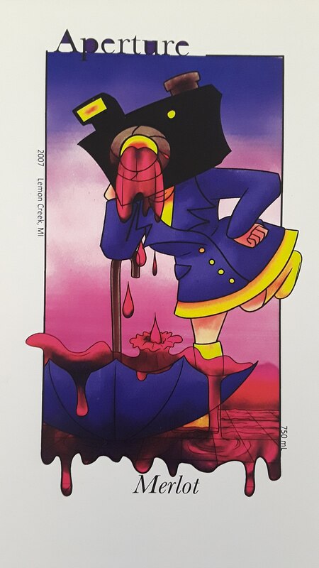
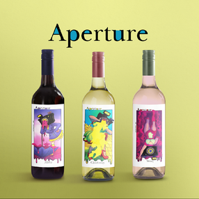
Label designs for a surreal themed winery.
|
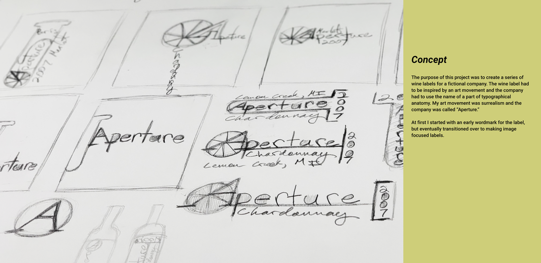
Aperture Winery was a project where I had to design a series of wine labels for a fictional company. The wine label had to be inspired by an art movement while the company was named after a part of the typographical anatomy. The name of the company was called "Aperture" while the theme of the label was surrealism.
|
|
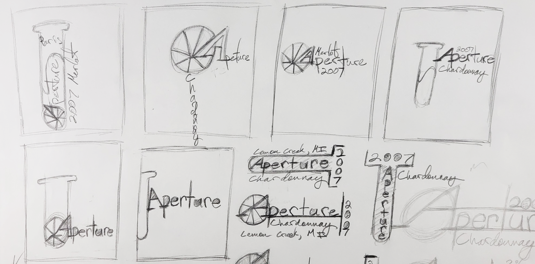
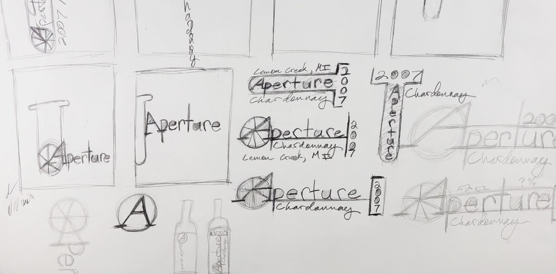
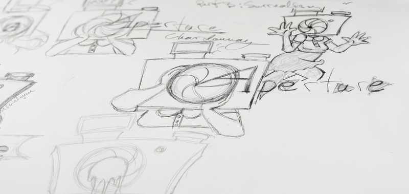
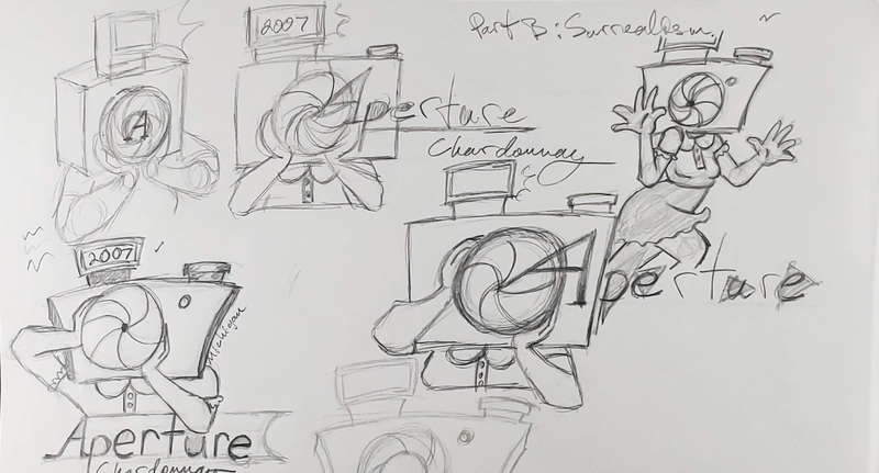
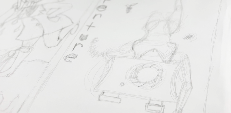
A good chunk of my preliminary sketches shown here were trying to achieve a wordmark design that conveys a surrealist theme. Very early on, I had ideas of wanting to draw attention to the apertures in the word "Aperture." I also wanted to play around with some camera elements to refer to the kind of aperture that is used in photography. For example, I was really into incorporating a camera lens/shutter somewhere in the logo.
|
|
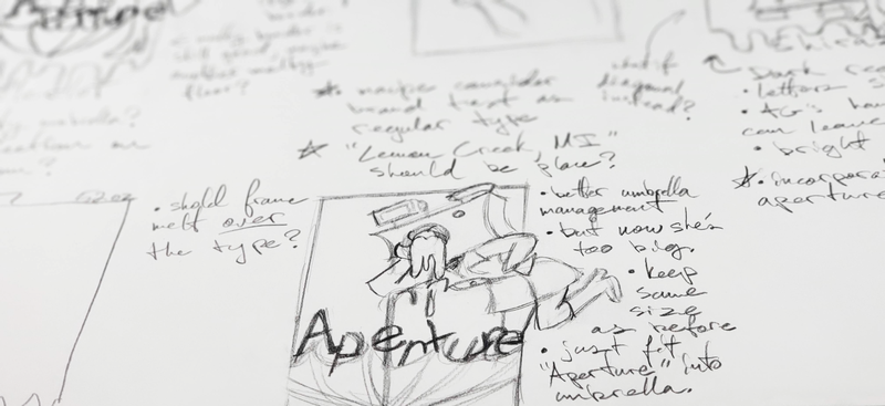
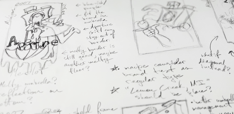
After my first session of brainstorming sketches; I felt a little bit lost because I didn't really like these wordmark ideas at all and they seemed so much cooler in my head than they did once I put them down on paper.
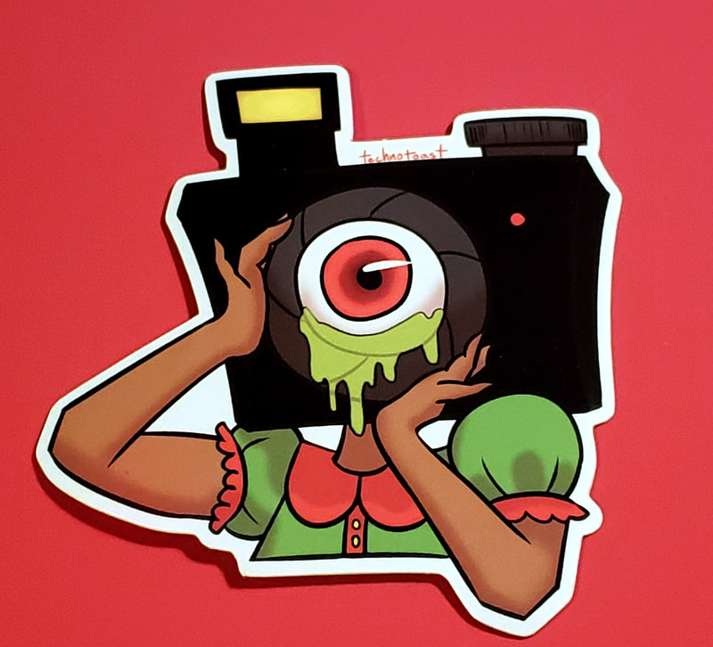
So I decided to do some research looking up existing wine bottle labels to see what kind of format they tend to adhere to. I wanted to know things like; how much text they tended to have, how big the labels usually are, and if they ever incorporate any imagery. It was at this point I started finding more labels that incorporated imagery and I felt that those had way more personality. I could remember the bottles that had some type of imagery way more than the bottles that were very light, elegant, and minimalist. So it gave me an idea of designing a surreal mascot for this winery. A mascot I called "The Aperture Girl." |
Finished Designs
|
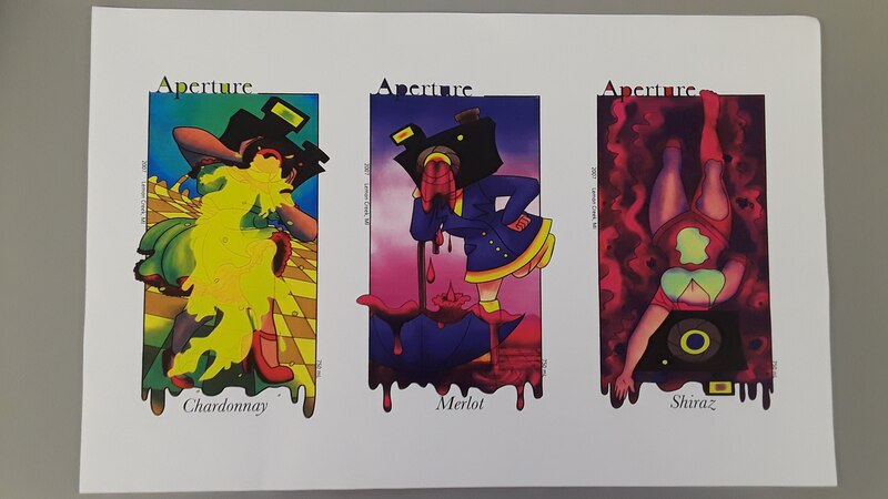
After I settled on making a wine label that was more image focused with a company mascot, making these surreal themed wine labels came so much easier to me. I was able to incorporate the ideas I really liked before (the camera imagery) and also make this series of labels something that would absolutely stand out and stay in a viewer's mind.
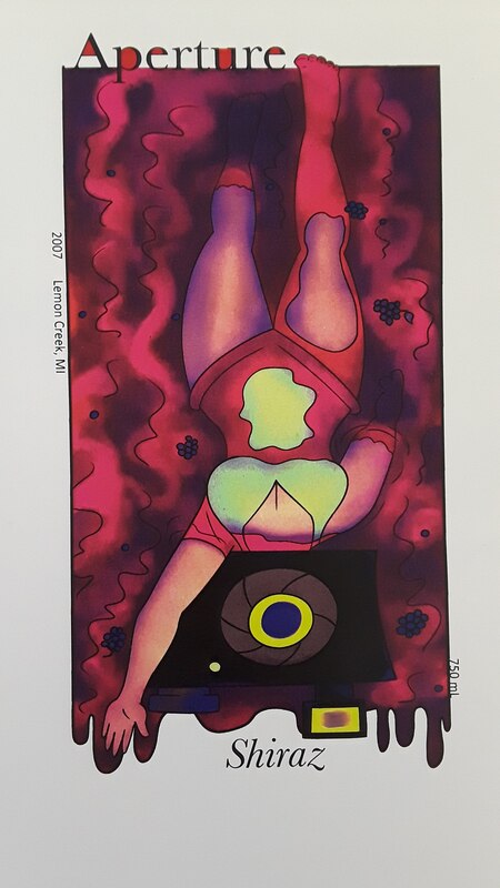
I specifically went out of my way to make the labels very strange and surreal with soft illustrations of the Aperture Girl featured in various actions with dream-like backgrounds. |
Afterwards
|
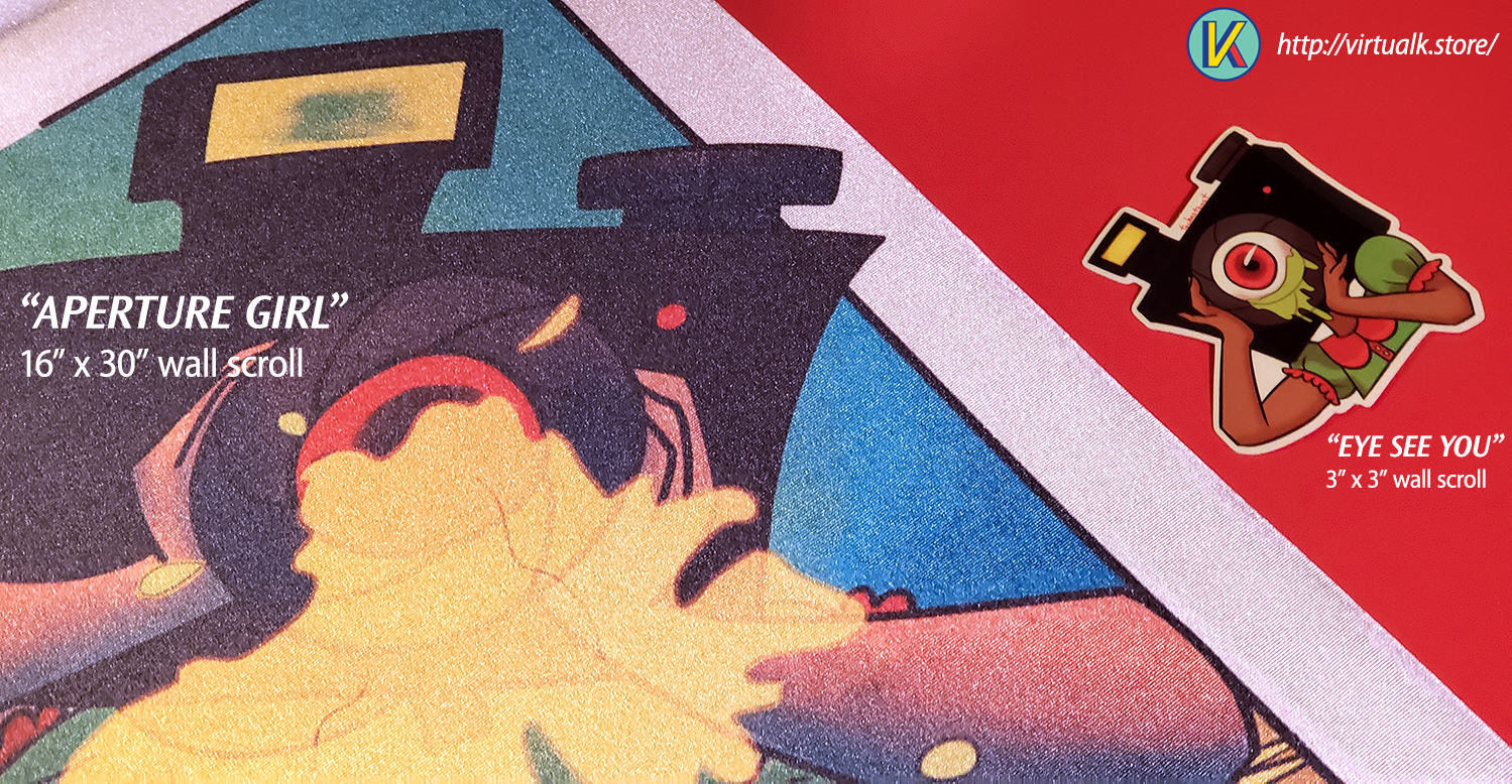
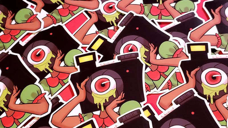
After this assignment, I found that I liked this mascot character a lot. So when I opened up Virtual-K for the first time a year or two later, I made products with her featured on them. Namely, a cute 3"x3" sticker design and a wall scroll of my favorite of the 3 wine label illustrations that I still have hanging up in my studio to this day.
I absolutely have plans to keep her around as a recurring character in my work in the future. |
Graphic Design
|
There's lots of things I love about graphic design, but I have a heavy lean towards brand identity, logo design, and motion graphics.
|
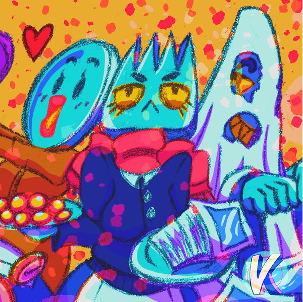
Virtual-KMy little art shop (or "art diner") where I sell my work in the form of stickers, prints, posters, keychain charms, and more!
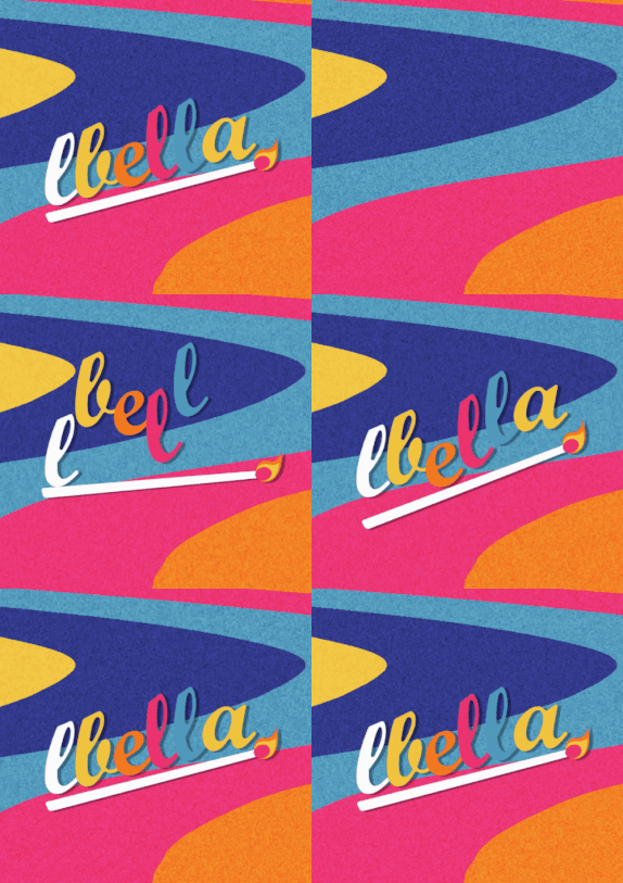
LBella Branding 2020Bold, colorful, and fun brand identity design I've done for myself!
"Paprika" Poster RedesignA movie poster redesign for the 2006 animated film, Paprika.
|
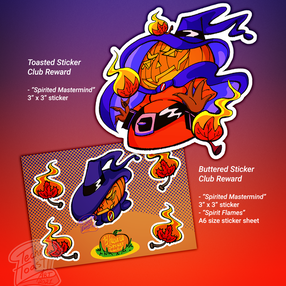
Virtual-K Sticker ClubA monthly "sticker of the month" club that people can subscribe to and get fun stickers in the mail each month. Works as an extension of my art diner, Virtual-K.
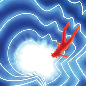
REMiniscenceThe story of an alien robot who crash landed here on Earth and collects dreams to make her way back home.
Aperture WineryWine label designs for a surreal themed winery.
|
Müv ColaBrand identity, logo design, motion graphics, and marketing for a bubbly new soda company that's all about summer vibes and a good time.
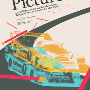
The Big PictureMarketing and book design for an exhibition featuring 2 notable advertising designers.
|
