The Big Picture
An exhibition featuring the advertising designs of Lucian Bernhard & Max Huber
|
The Big Picture was a project about taking two notable designers and creating a fictional exhibition around them and their work. There had to be a poster design and one page website that advertised the event as well as a handmade book showcasing the designers and their work.
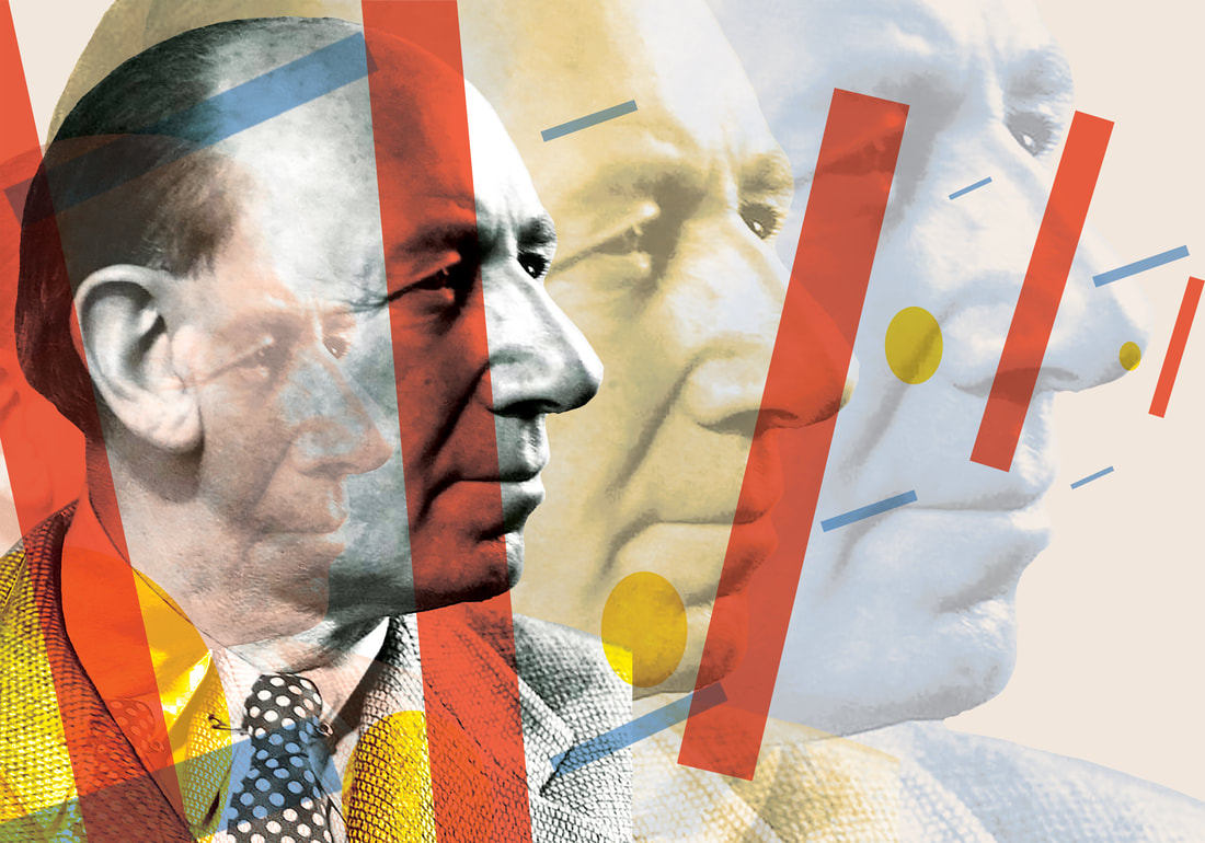
The designers I chose were Lucian Bernhard and Max Huber, both of them known for their style of advertising design. Both of their works stood out to me in a very big way because of the colors they use and how they incorporate imagery into their work. |
The Poster
|
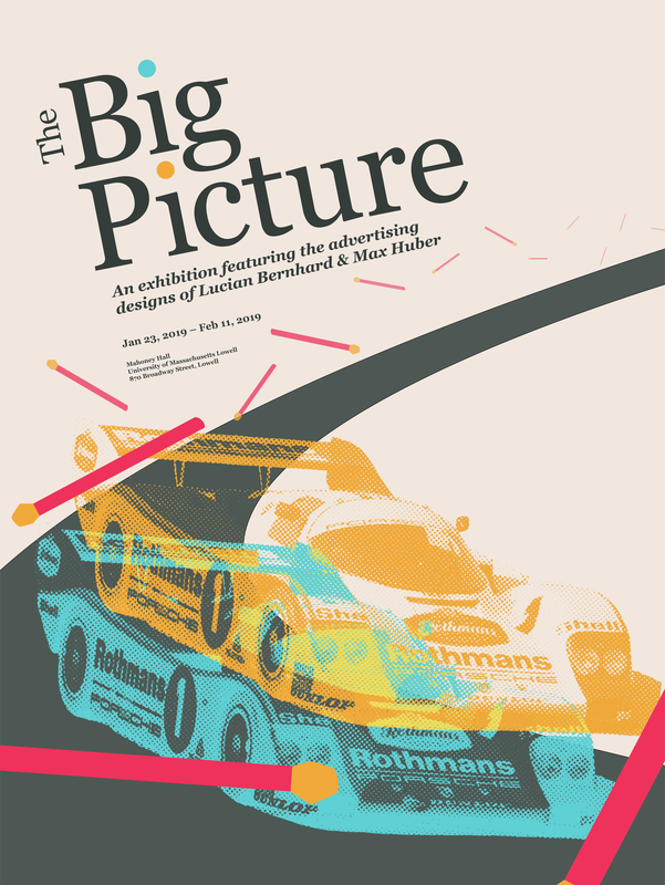
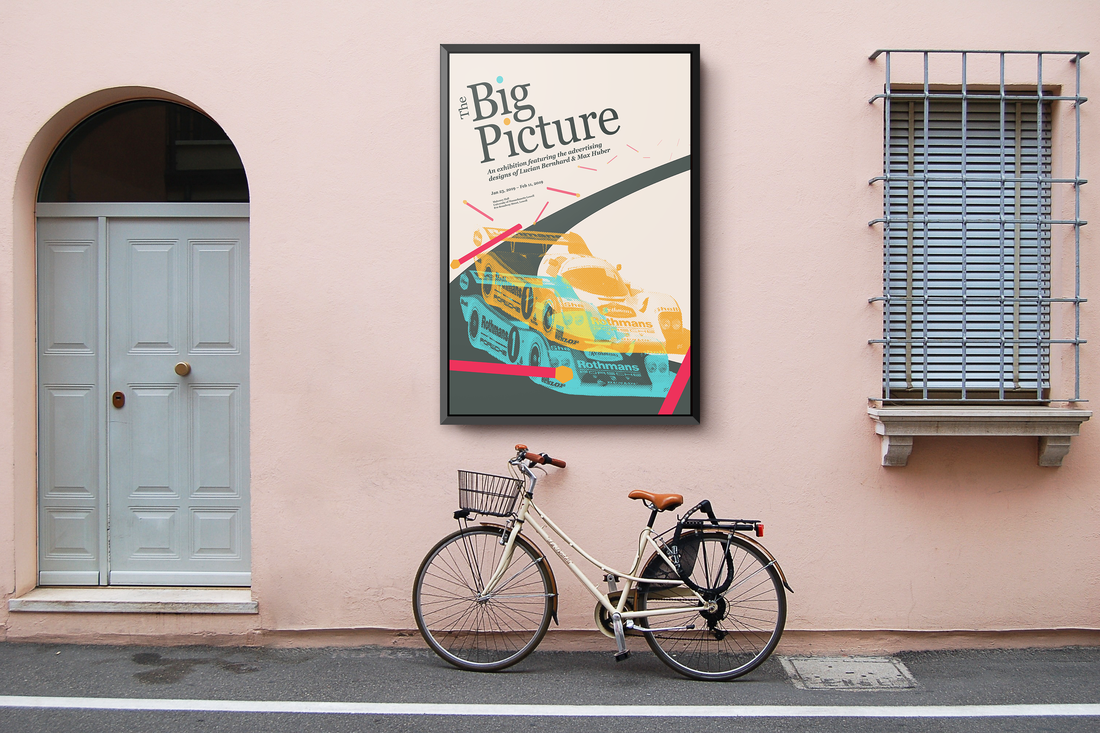
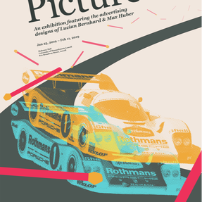
The poster was one of the more fun parts of this project for me to design. Throughout the whole project I've been incorporating an overarching theme of "what if one of these designers remade the work of the other designer?" and I've really gotten a kick out of mixing and matching different elements I really like from their works. For the poster specifically, I was very into taking the racecars from one of Huber's posters and combining it with Bernhard's matches from one of his posters.
|
The Book
|
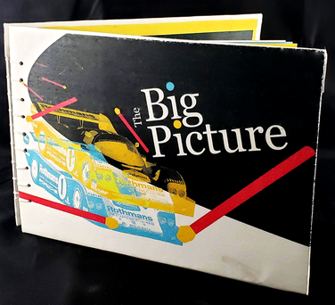
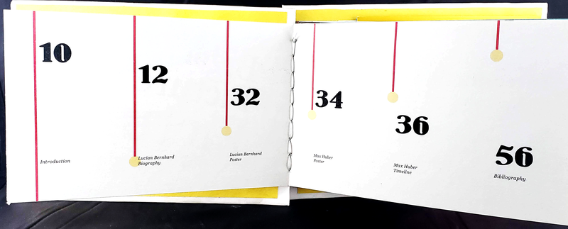
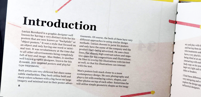
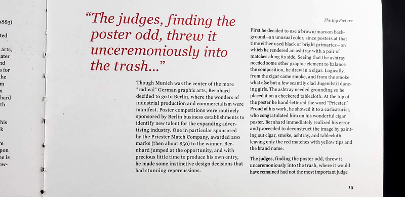
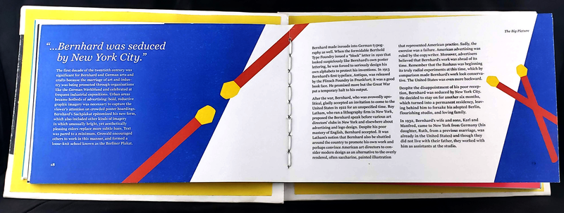
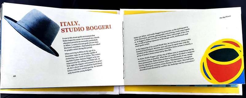
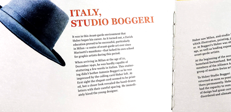
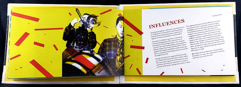
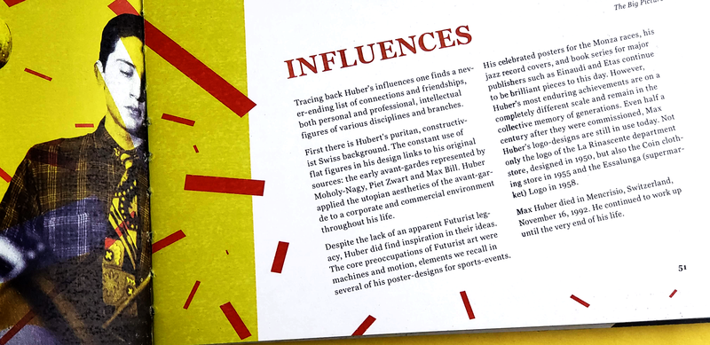
The book was probably the most difficult part of the whole project to design. Not necessarily because I didn't know how to approach it but because this was something where I had to take everything into consideration on a much wider scale than I was used to.
I had to carefully consider the typesetting, fonts, recurring text placements such as page numbers and making sure that everything written in the text made sense grammatically as well as spelled correctly. And all of that in addition to providing visual interest to each spread that was nice to look at but also didn't overshadow the text, as well as formatting this book correctly for printing and assembling myself, by hand. It was definitely the most time intensive part of the project that definitely took me out of my comfort zone, but there are so many spreads and different parts of this book that I still adore to this day. |
Lucian Berhnhard
|
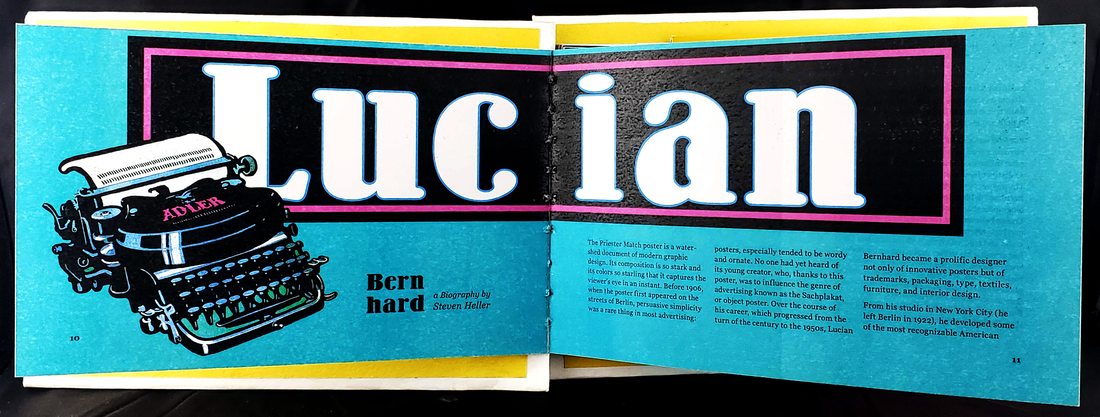
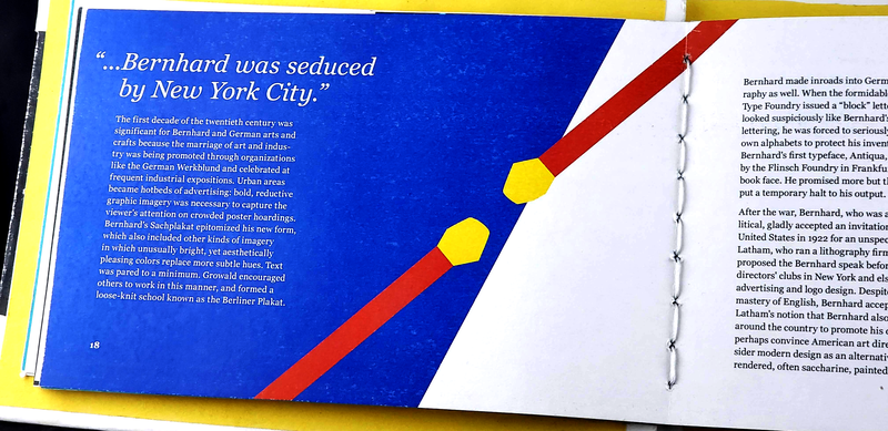
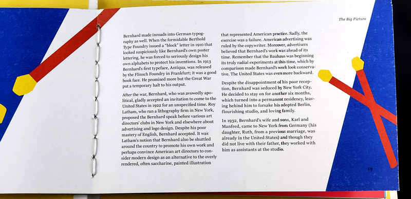
Lucian Bernhard (born 1883, died 1972) was a graphic designer well known for having a very distinct style for his posters that are now known as "Sachplakt" or "object posters." A poster style that focused on an object and had very minimal text.
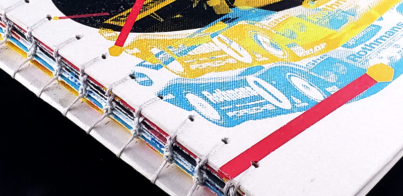
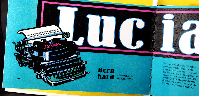
I really loved how Bernhard would illustrate very lovely depictions of the objects he was advertising and use minimal text in his designs. They were like really nice paintings that also had enough space to breathe. For many different spreads in the book, I still incorporated one of my design themes of taking elements from different posters the designer made and reusing or repurposing them somehow. For example; this spread pictured above is me deconstructing Bernhard's poster advertisement for Adler typewriters and turning it into the opening spread for his section of the book. |
Max Huber
|
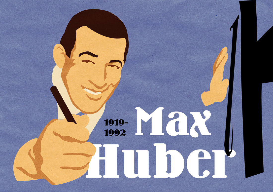
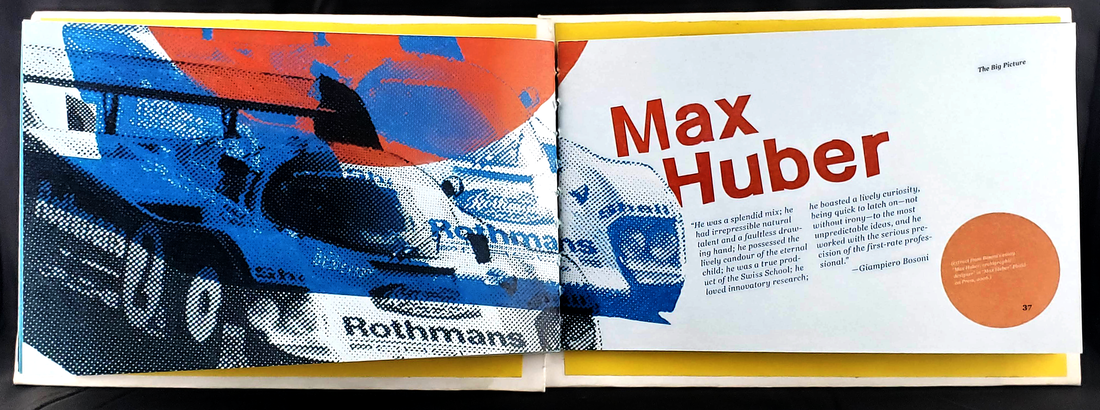
Max Huber (born 1919, died 1992) was another well known graphic designer known for his dynamic, jazz inspired posters and playful type treatments.
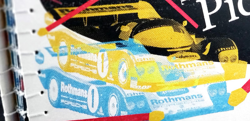
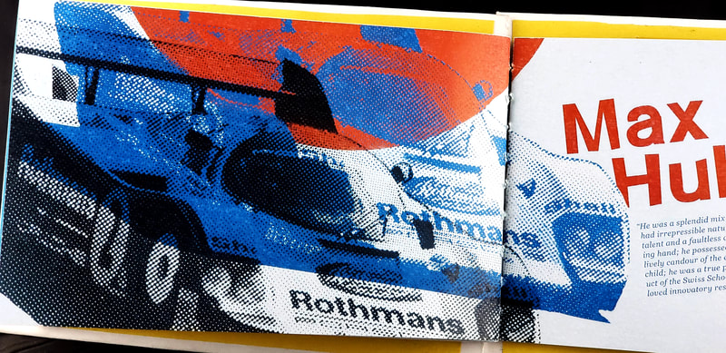
I was extremely pulled into Huber's designs by the way he treated images and text. Everything he designed always felt so alive; text was aligned on angles, different fun shapes and bold colors would overlap in the background or interact with the main image he was designing with. I was really taken with the way he designed this Porsche racing poster and it served as a massive inspiration for what I wanted to do with the cover of this book and the poster. I really wanted to bring that same kind of energy to all of his spreads with various elements from his different posters all interacting with the page or the text in multiple ways. |
The Website
|
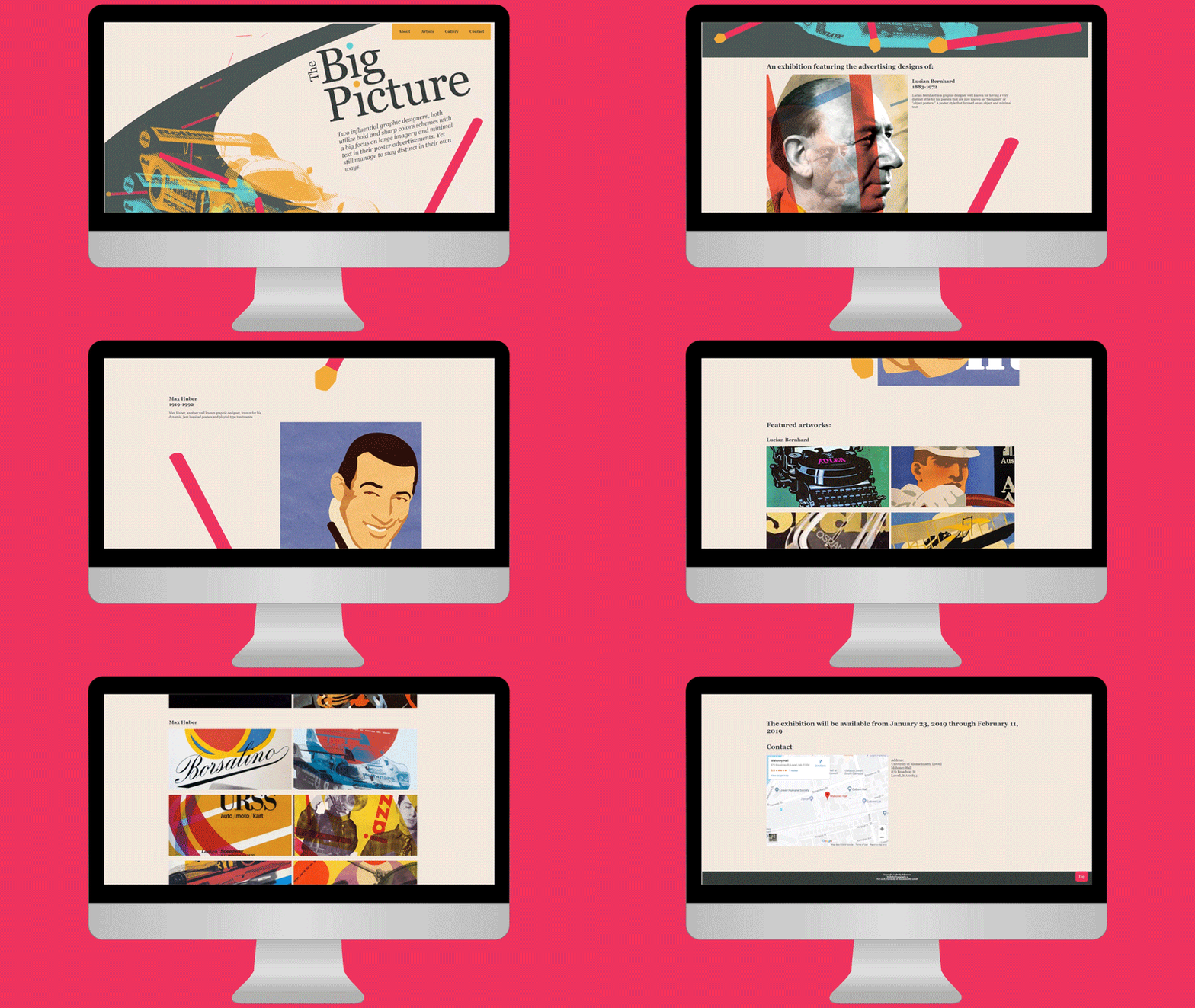
The website was definitely something that, for me, wasn't as difficult as designing the book and assembling the book myself, but it wasn't as easy as designing the poster.
I had done some HTML & CSS coding before I had entered my graphic design program at UMass Lowell so there was definitely some stuff I still remembered how to do, but since it had been a couple years there were definitely new and improved ways to make this that I had to learn. For the website I wanted it to be a brief summary of what the featured designers were known for and include some examples of their work and then provide a time, date, and location for when this exhibition was going to take place. |
Graphic Design
|
There's lots of things I love about graphic design, but I have a heavy lean towards brand identity, logo design, and motion graphics.
|
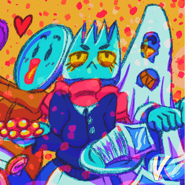
Virtual-KMy little art shop (or "art diner") where I sell my work in the form of stickers, prints, posters, keychain charms, and more!
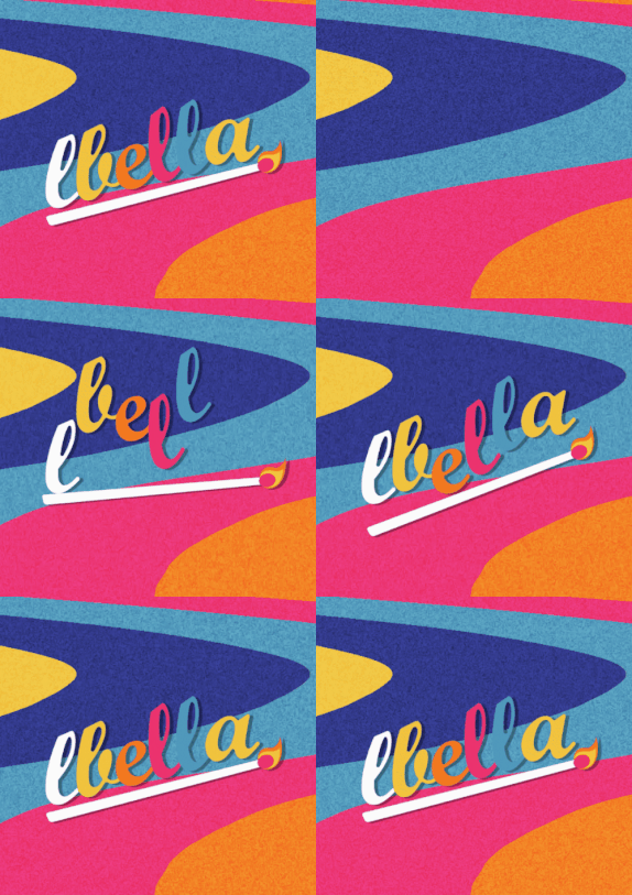
LBella Branding 2020Bold, colorful, and fun brand identity design I've done for myself!
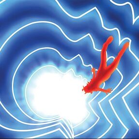
"Paprika" Poster RedesignA movie poster redesign for the 2006 animated film, Paprika.
|
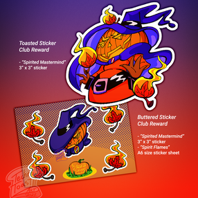
Virtual-K Sticker ClubA monthly "sticker of the month" club that people can subscribe to and get fun stickers in the mail each month. Works as an extension of my art diner, Virtual-K.
REMiniscenceThe story of an alien robot who crash landed here on Earth and collects dreams to make her way back home.
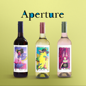
Aperture WineryWine label designs for a surreal themed winery.
|
Müv ColaBrand identity, logo design, motion graphics, and marketing for a bubbly new soda company that's all about summer vibes and a good time.
The Big PictureMarketing and book design for an exhibition featuring 2 notable advertising designers.
|
