Virtual-K
The design, branding, and marketing of my little art diner.
|
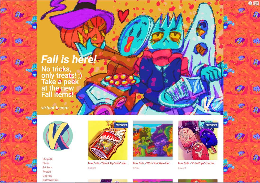
Virtual-K is my surreal art shop where I sell stickers, charms, prints, posters, and anything else my heart desires. All of these items feature my strange, surreal, and mostly character based designs. I run this under my more illustration focused online facing persona, "TechnoToast."
When it comes to the concept of Virtual-K, I've been super inspired by the existence of Johnny Cupcakes. In the early stages of branding for Virtual-K, I said to myself "Well if there can be a t-shirt bakery, why can't I have an art diner?" And from that point on I've aimed to brand Virtual-K like a surreal art diner. Since my shop is still fairly new and small in this iteration, the branding for it is always evolving and I always want to make it better. This iteration of my store has been around since 2019 but has gone through various evolutions since then. |
Research
|
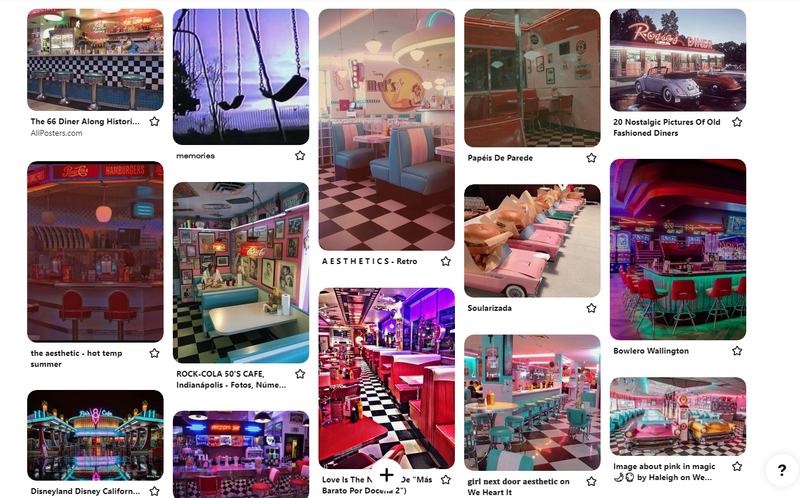
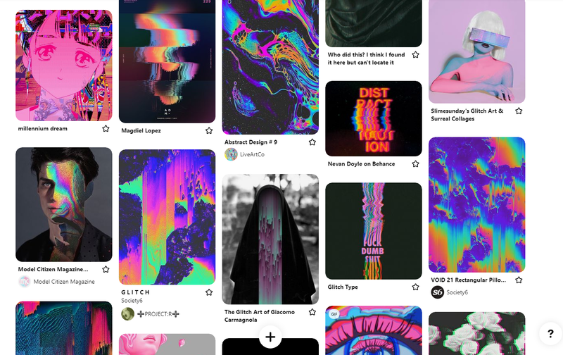
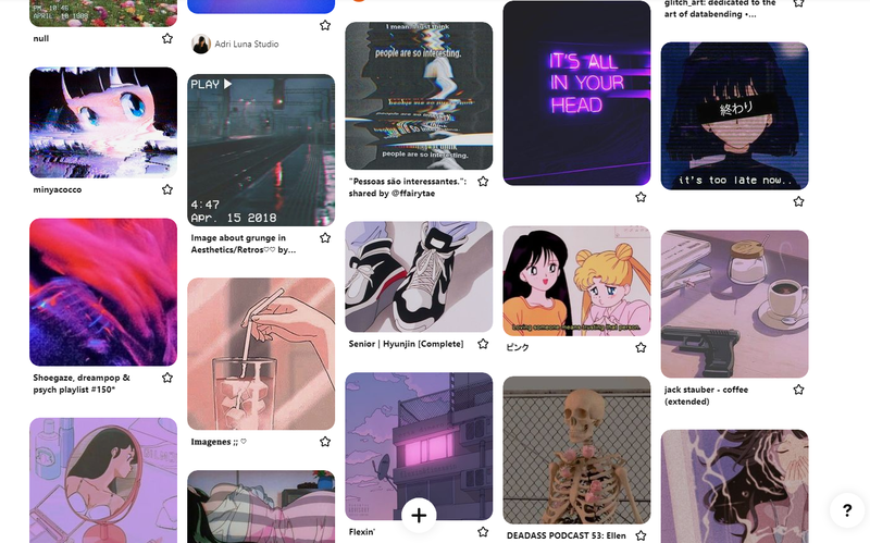
During my initial research, I spent a good amount of time on Pinterest looking for inspiration relating to diners and surreal art. The thing I wanted to avoid was making Virtual-K look like a standard and typical 50s diner. I more so wanted the suggestion that it was a diner, but a very irregular one.
|
Moodboards for diners, surreal/psychedelic looking art, and dreamy/ethereal cartoon images.
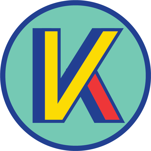
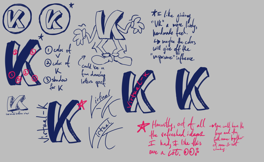
LogoIn the early days of VK's branding, I had a very sharp and rigid idea for the logo. It looked nice at the time but it's only recently I decided to give it a bit more life by hand drawing it instead of relying on the cold precise exactness I tend to get from Adobe Illustrator.
|
|
Looking back at the logo evolution makes me laugh because I remember going through so many different phases and ideas back when I first started. I had a massive Illustrator document with tons of iterations in a quest to make the perfect logo, and yet only 3 years later I'd completely change my mind and go for something a lot more friendly, dynamic, and drawn directly by my hand.
|
|
At the time I remembered turning to my friends (none of them were graphic designers) and asking them just for their immediate thoughts upon seeing the logo. I wanted to get first impressions and seeing how they reacted to different iterations.
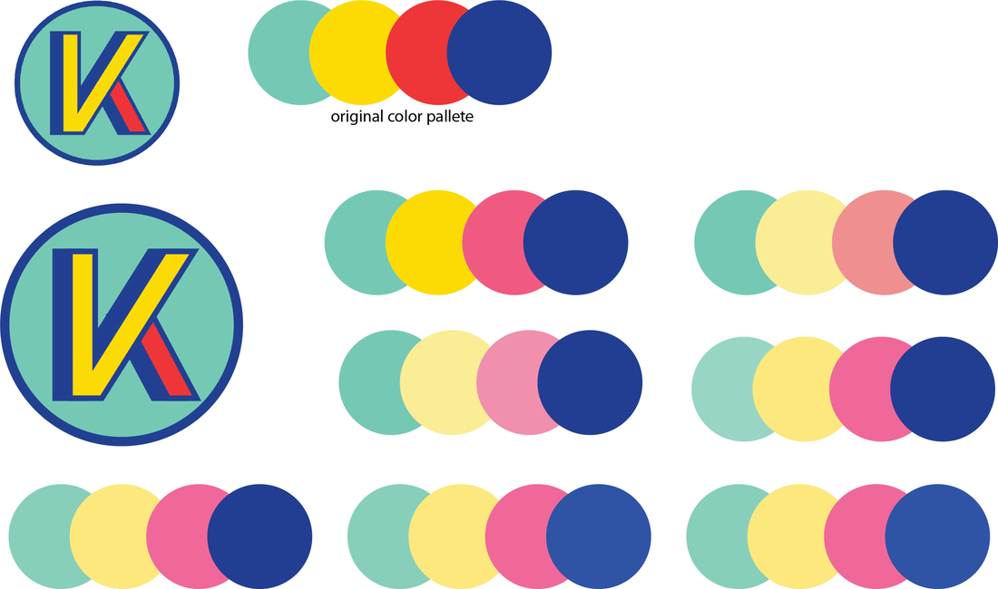
I did this a few times over the course of me filling up this document. At the same time I also tried to come up with some brand colors for VK, so you'll see a lot of different color tests there too to see which combos I liked better. I guess what really prompted me to move from the 2019 logo to the current 2021 one is that I started thinking about what I originally wanted for Virtual-K: I wanted it to be surreal, a little off the wall, and the feeling that it was made by hand. It is a logo for an art shop after all, where everything in the shop is something I've drawn/designed with my own hands.
|
Branding
|
The name "Virtual-K" is short for "Virtual Kitchen." Since my online facing persona is called "TechnoToast" I thought it would be a fun way to play on that theme of like something digital and something to do with food.
There's also a part of me that likes that the name implies that it's a place that only exists digitally (which is true), but it's also a place where items get made and the customers get to "consume" them. In real life; the art is absolutely not edible. However, I really enjoy the running gag of pretending like it is or making product collections that are food based. |
|
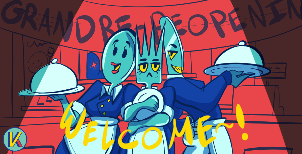
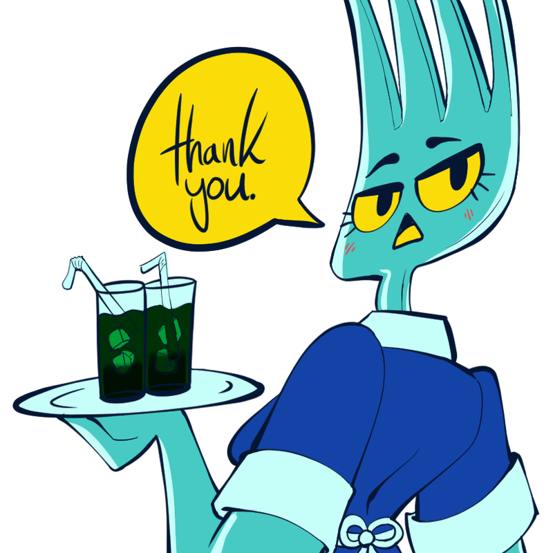
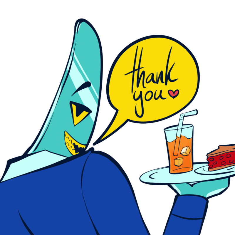
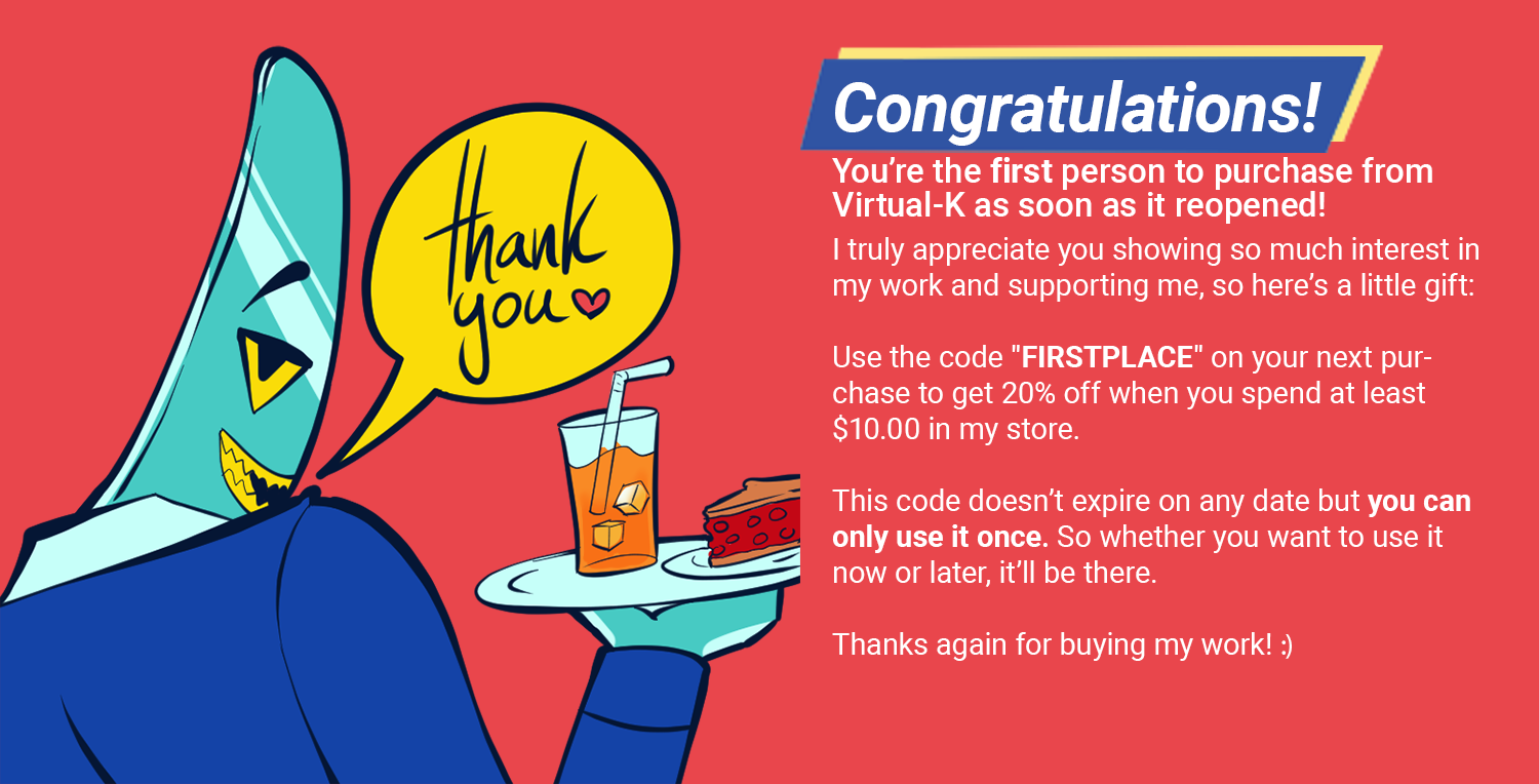
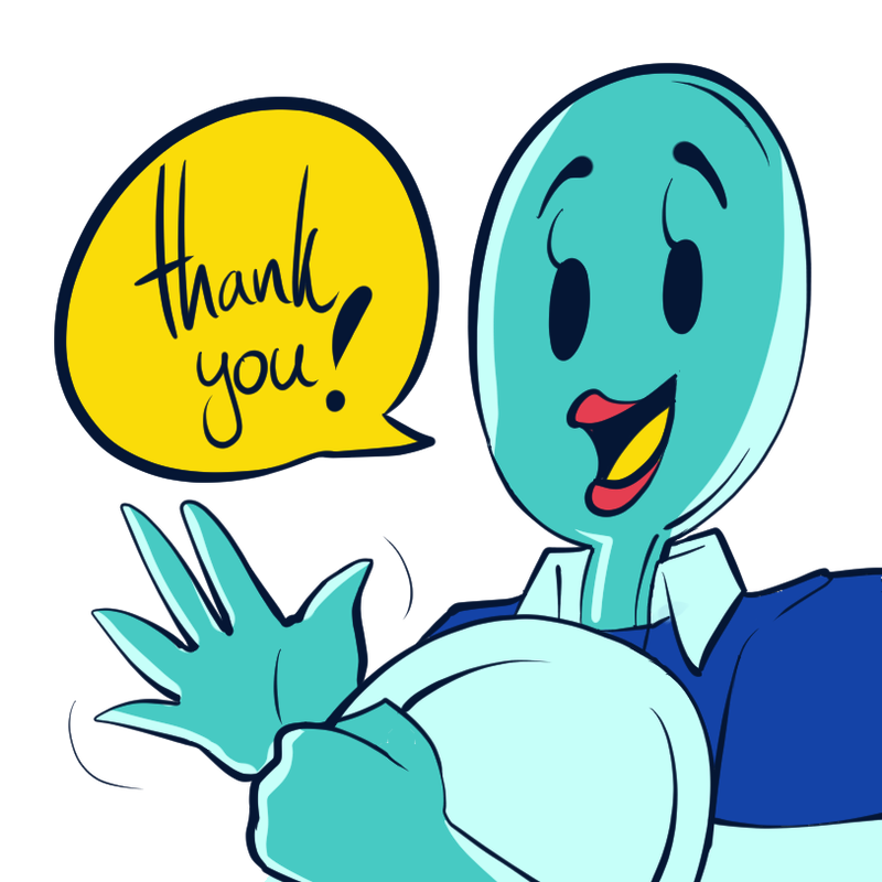
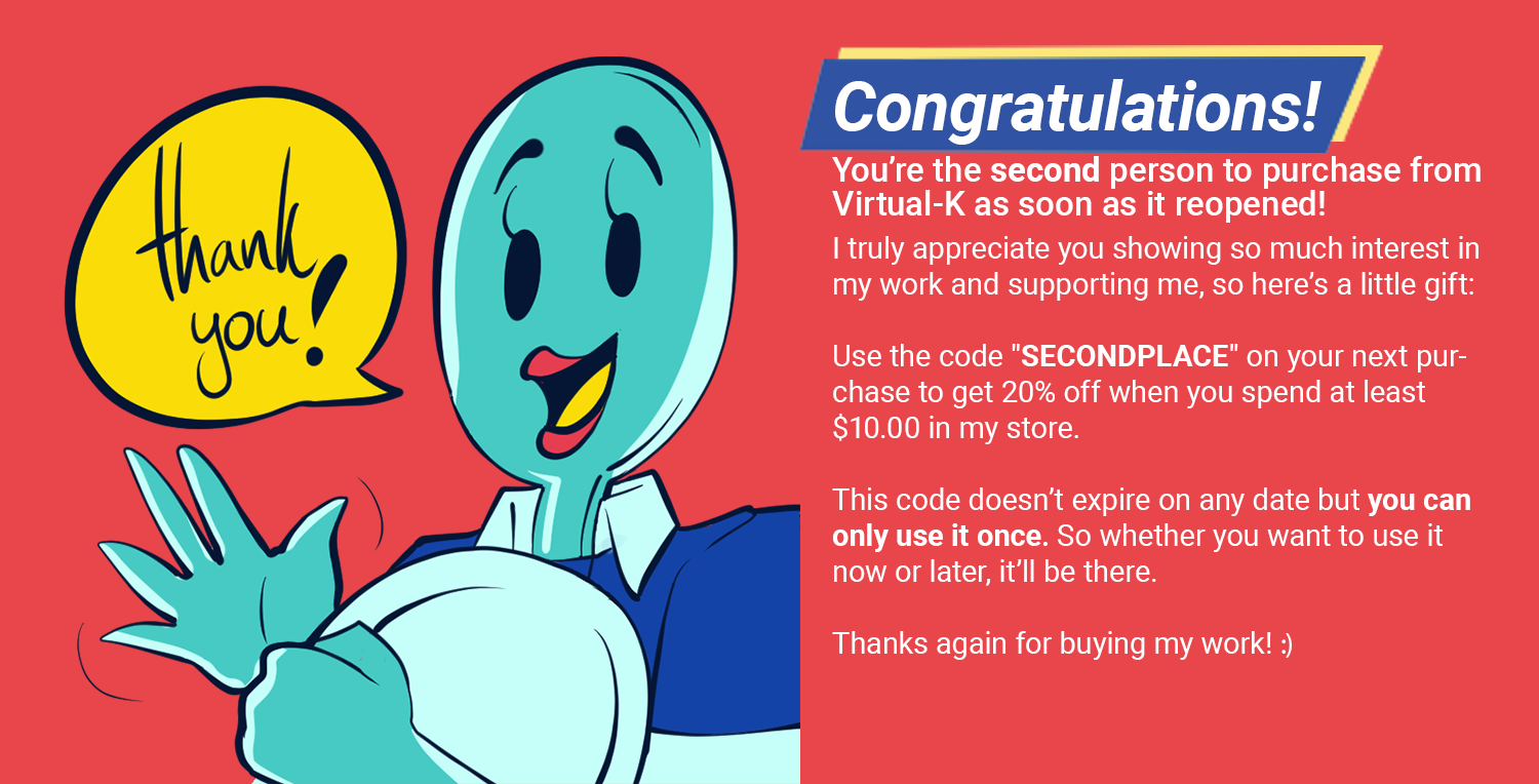
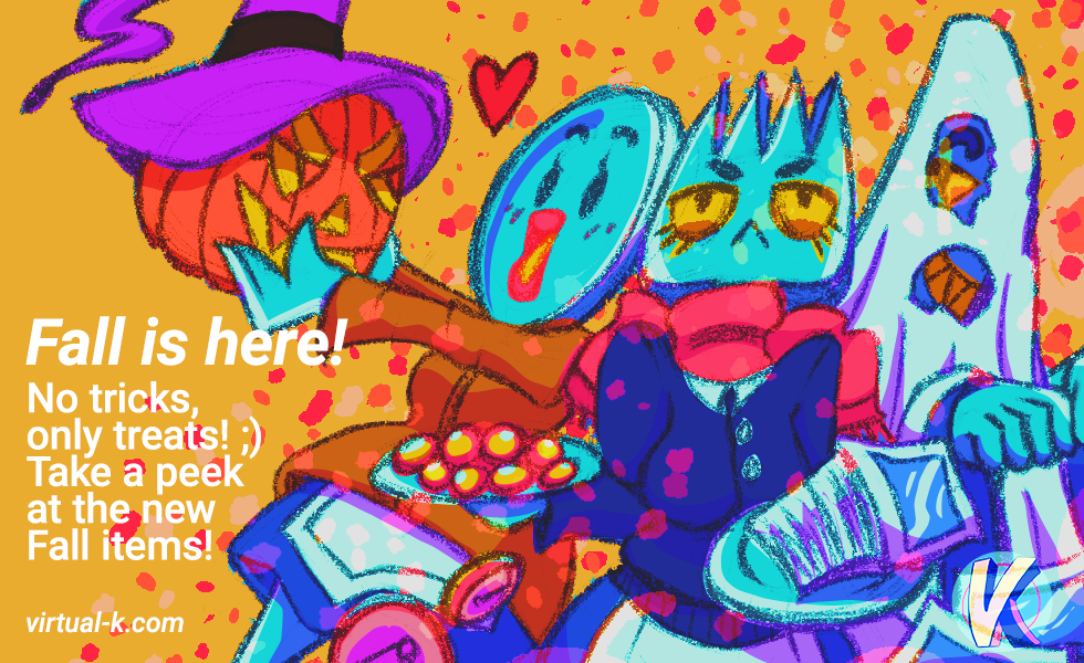
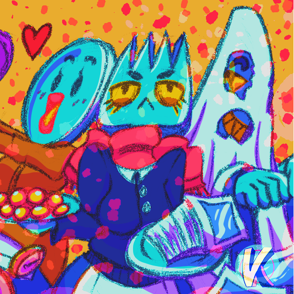
I feel at this point it should not come to the surprise of anyone that I wanted to create mascots for my shop too. But this time, they're a crew made up of a sentient fork, knife, and spoon, who all work as waiters in my art diner.
|
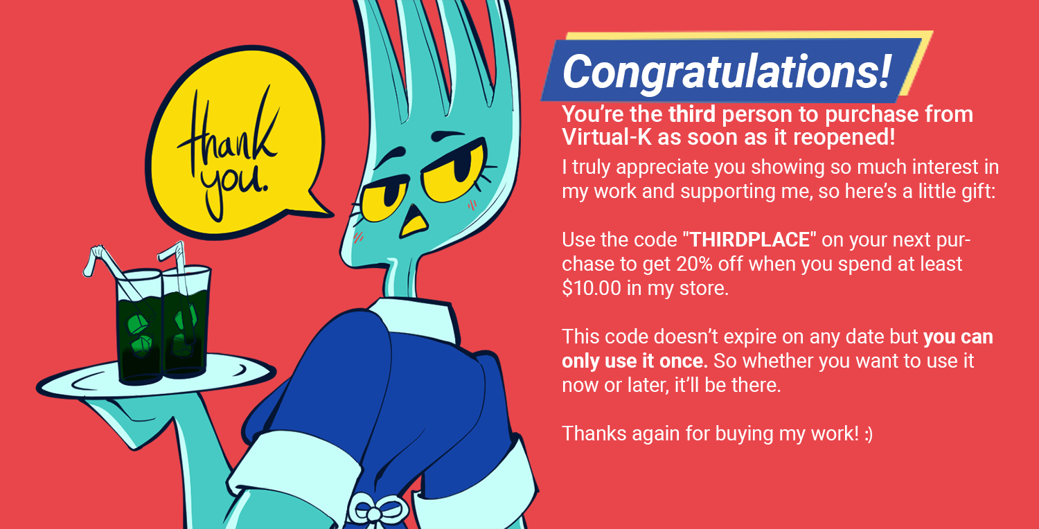
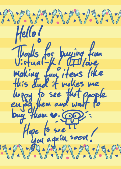
These are illustrations I made to go alongside some thank you notes/flyers I sent out with the first 3 orders when I officially reopened in early 2021.
|
In my opinion, the most endearing part about engaging with small businesses like mine is being able to tell that there's a real human behind the scenes either going solo or working with a small team and that is able to put love and care into each order. Whether it's writing personal thank yous or giving small gifts with the order to express gratitude. So in a lot of the marketing or branding that I end up shipping directly to customers, I make sure to include that human connection.
|
Marketing
|
When it comes to marketing for Virtual-K, it can take multiple forms. Most of the time it is social media based advertising but there are other times where I want to advertise a specific thing in a new place.
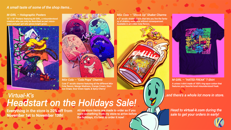
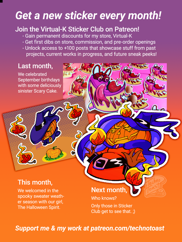
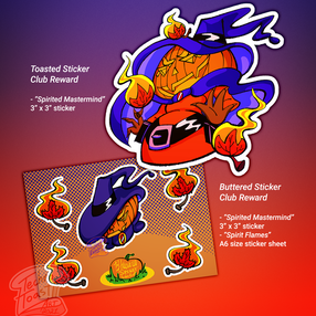
For example; I made a flyer for my sticker club that was specifically made to be printed. I featured last month's sticker, the current month's sticker, and tease that only club members will know what next month's sticker will be, with a call to action. This was a flyer that I sent out with any orders for that month as well as any printed commissions people have ordered from me. Another example: I made a flyer advertising my holiday sale that I held pretty early to ensure that people would get future holiday gifts in time (everything in my shop is made-to-order). It was going to be posted online in multiple places and that would be printed out to be mailed with any orders or printed commissions for that month. |
Products
|
The following is a selection of some of the items available in my shop right now. Some of these projects are a lot more in-depth than they initially appear, and others are a little more on the goofy side that I made purely for fun. Some of these products even feature recurring characters from other portfolio pieces here on my site. In general I try to maintain a fun and occasionally creepy-cute tone across all VK original collections and items.
You can also visit Virtual-K right now to see more things that aren't featured here. |
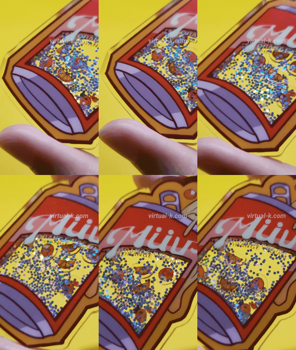
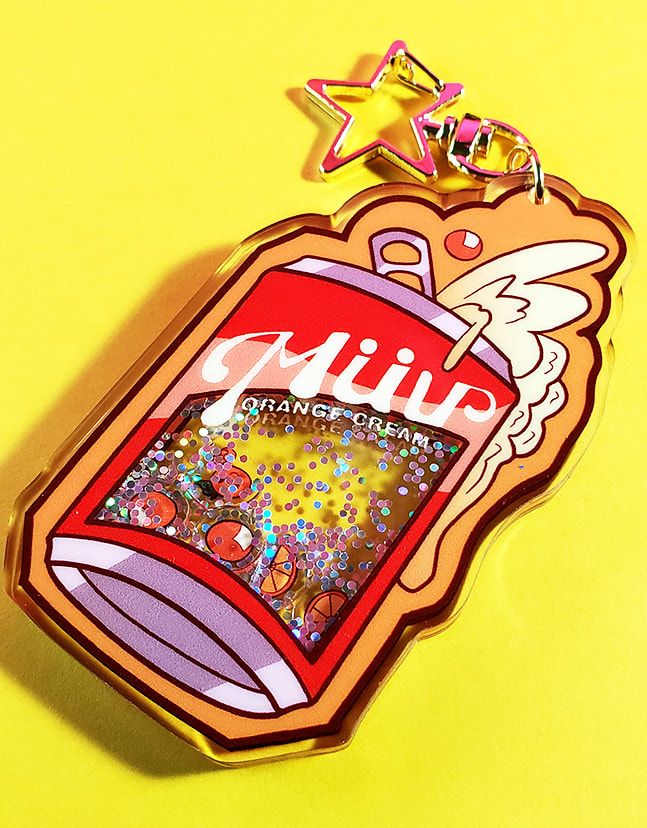
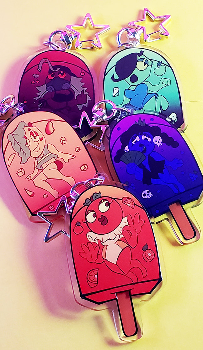
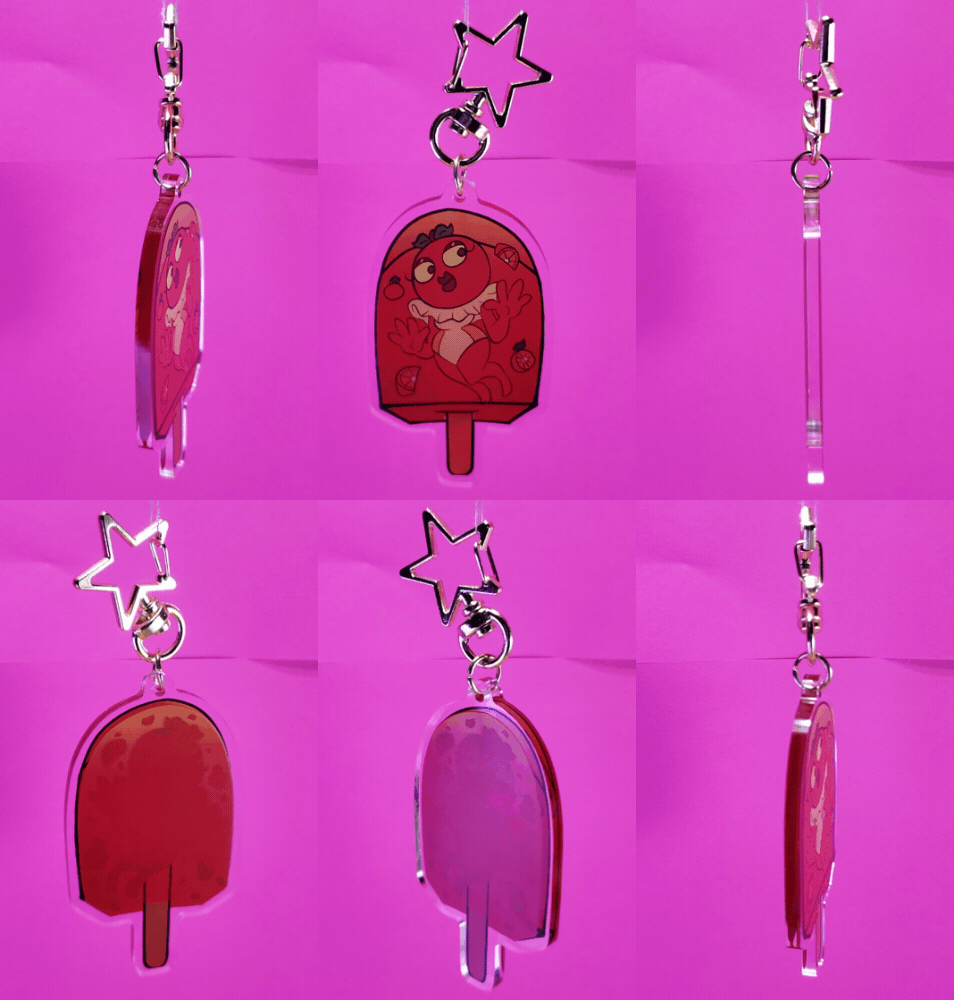
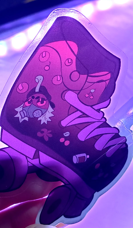
Müv Cola collectionSummer is in full swing and Müv Cola is skating their way into your hearts! Enjoy some delicious Cola Pops by buying any of these cute 3" acrylic charms! — from the cola pop description.
|
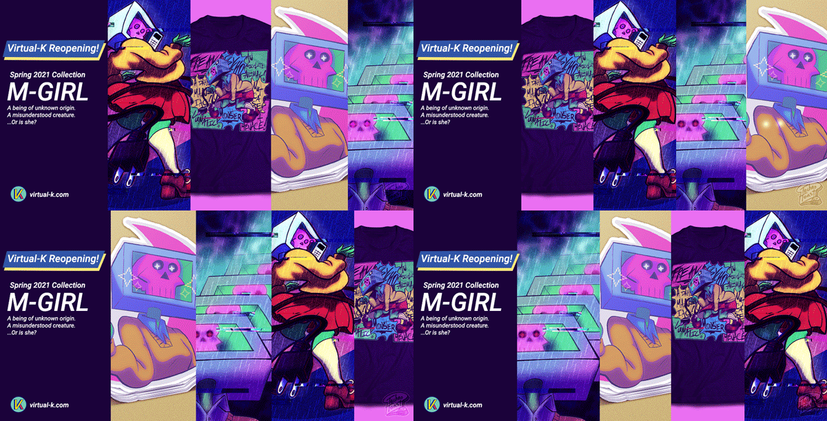
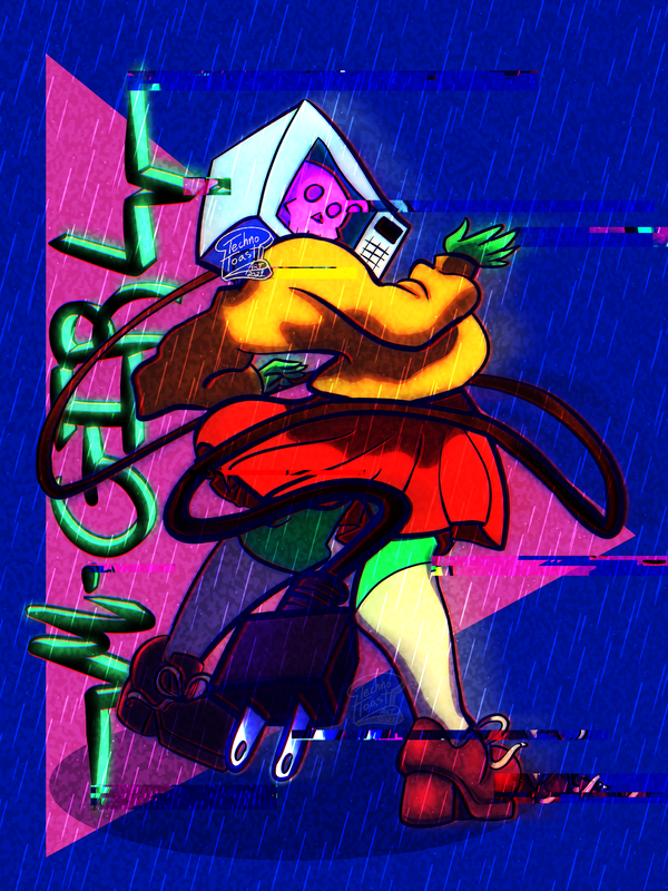
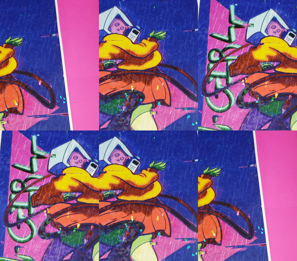
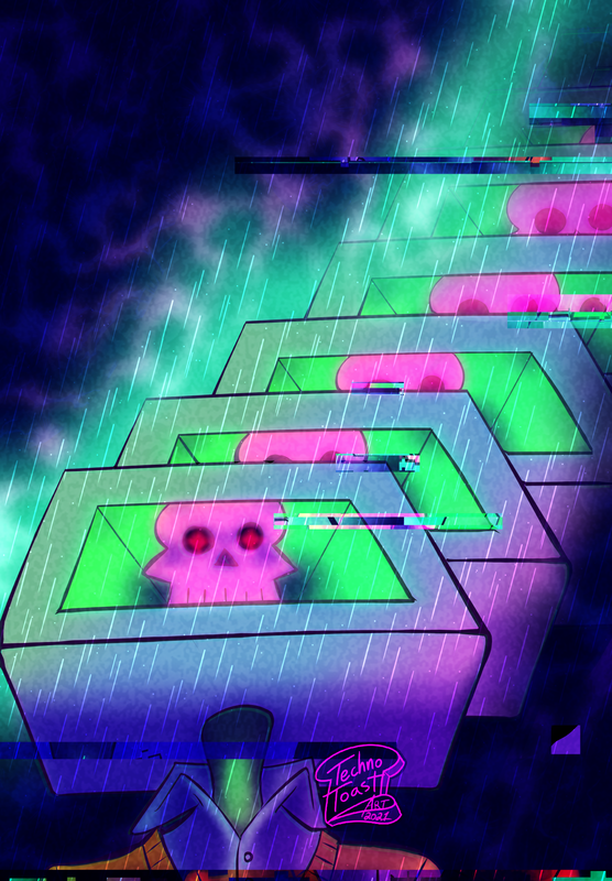
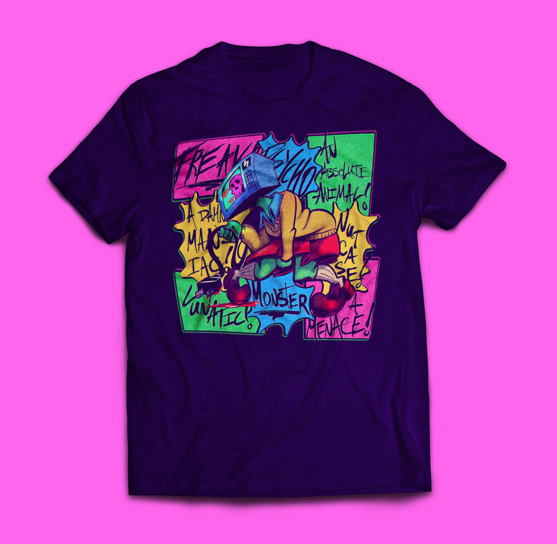
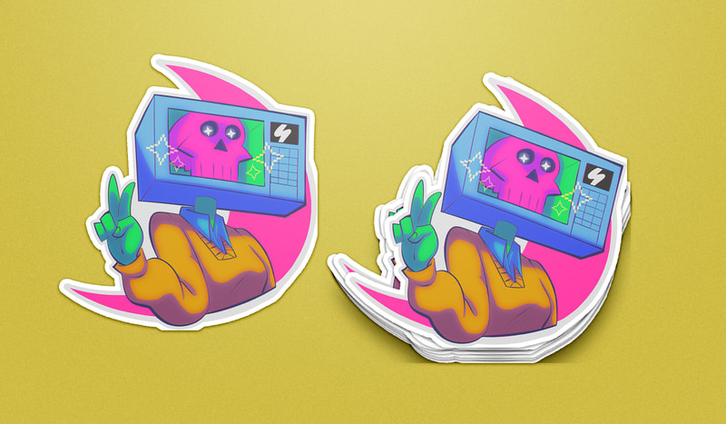
M-GIRL collectionReports of a mysterious creature described as "part girl, part microwave," is on the run from local police. She is considered armed and dangerous. — from the M-GIRL poster description.
|
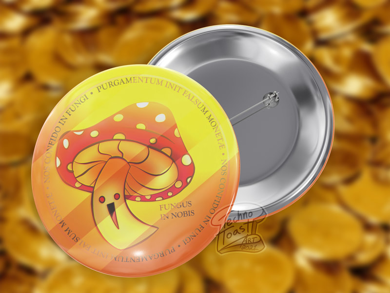
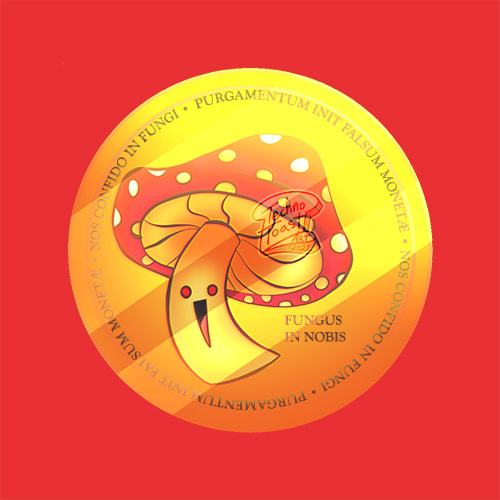
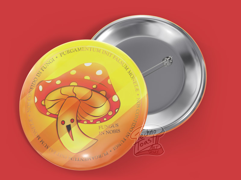
"Fungus Token" buttonsI just made a new craptocurrency called Fungus Token and I'm happy to announce that my New Fungus Token just dropped! — from the product description.
|
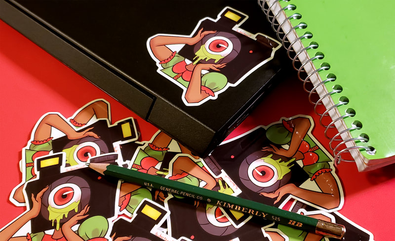
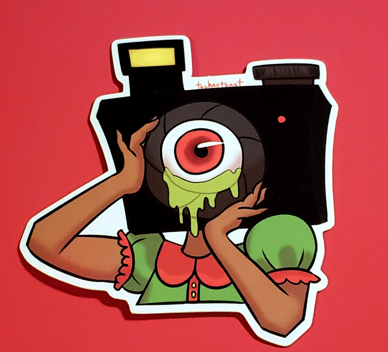
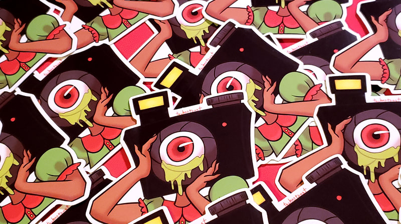
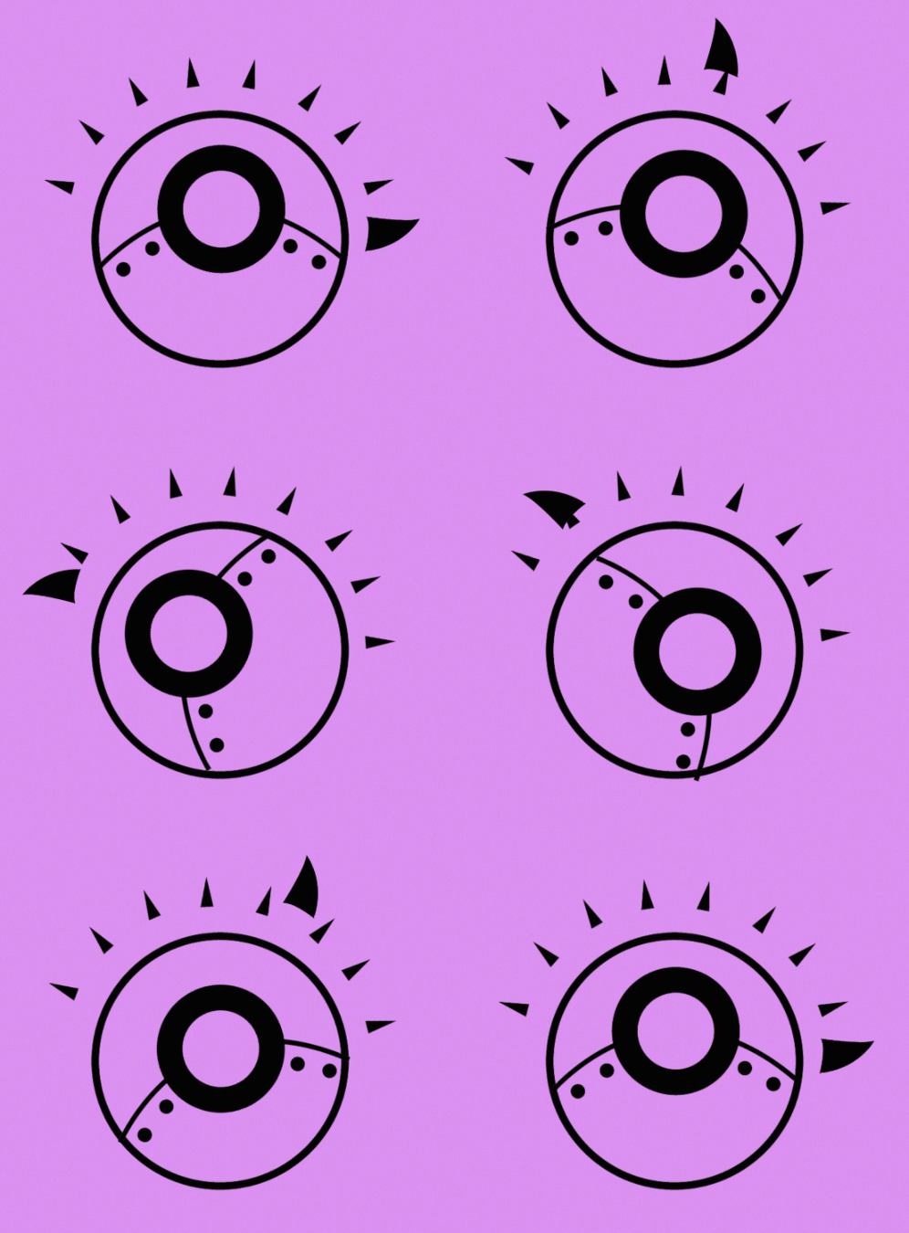
"Eye See You" stickersThe surreal poster girl for Aperture Winery has returned in sticker form with a new eye-catching addition! — from the product description.
|
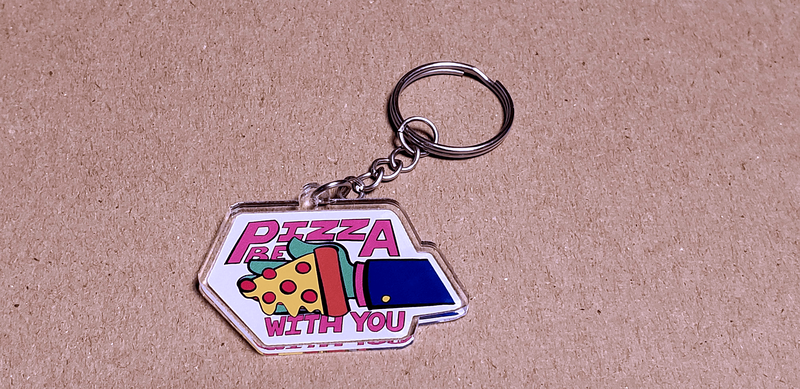
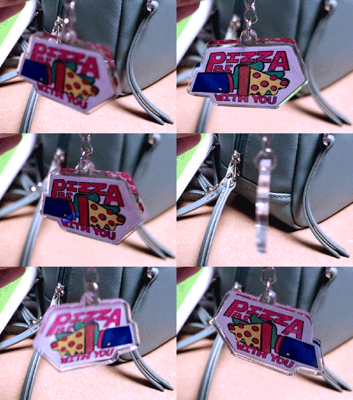
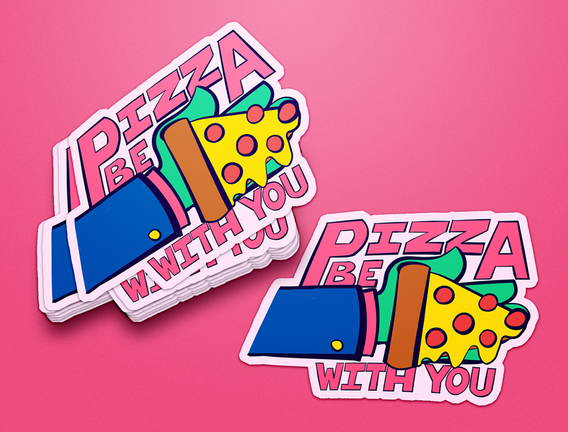
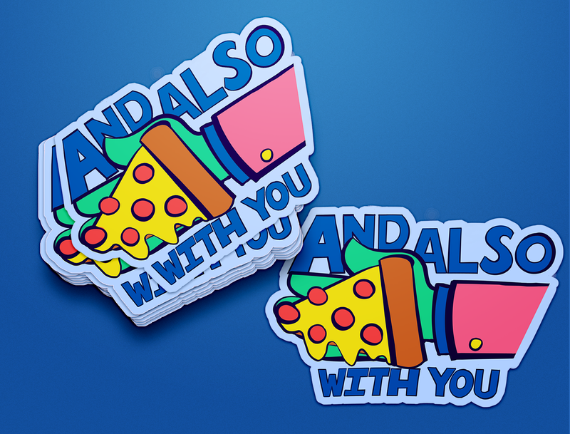
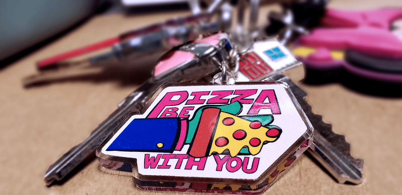
"Pizza Be With You" collection"Pizza Be With You." |
Graphic Design
|
There's lots of things I love about graphic design, but I have a heavy lean towards brand identity, logo design, and motion graphics.
|
Virtual-KMy little art shop (or "art diner") where I sell my work in the form of stickers, prints, posters, keychain charms, and more!
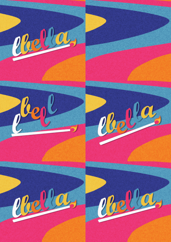
LBella Branding 2020Bold, colorful, and fun brand identity design I've done for myself!
"Paprika" Poster RedesignA movie poster redesign for the 2006 animated film, Paprika.
|
Virtual-K Sticker ClubA monthly "sticker of the month" club that people can subscribe to and get fun stickers in the mail each month. Works as an extension of my art diner, Virtual-K.
REMiniscenceThe story of an alien robot who crash landed here on Earth and collects dreams to make her way back home.
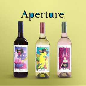
Aperture WineryWine label designs for a surreal themed winery.
|
Müv ColaBrand identity, logo design, motion graphics, and marketing for a bubbly new soda company that's all about summer vibes and a good time.
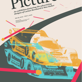
The Big PictureMarketing and book design for a fictional exhibition featuring 2 big advertising designers.
|
